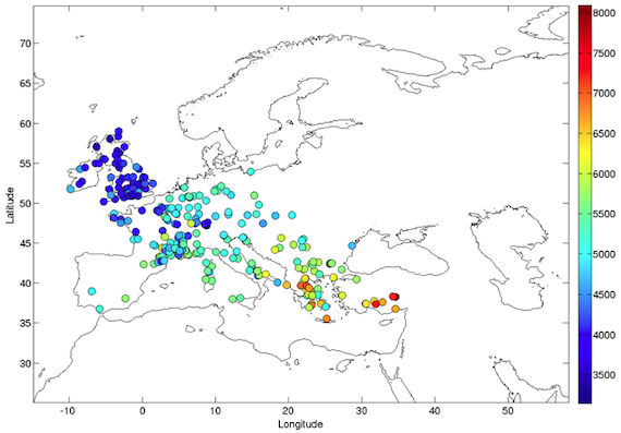
Improved version of Fig. 1 from Baggaley et al by Boy and Baggaley elsewhere on the interwebs.
Sooo cool. I’ve been thinking about making a version of this figure myself, just to see the pattern. Quite excited to find that someone else has already done so.
Shows a persistent impetus to move along. Note that as time goes along there are more dots for each color…which I interpret as more people, so more cultural deposits left to be dated….
16 June 2013 at 10:22 am
Pooh says:
What are the units represented by the dots and the colors? Is it years BCE, or number of artifacts, or …?
“youth” wants to know.
16 June 2013 at 10:42 am
Sammy says:
Ah, Youth, thanks for asking. The dots are sites, and the color shows the date for the occupation, with red/orange older and green/blues later—in years before present (the acronym varies, but I often use yBP). The original notes that the dates are calibrated, which means adjusted from the laboratory date based on information from tree rings and other adjustments, because the radiocarbon curve is…irregular.