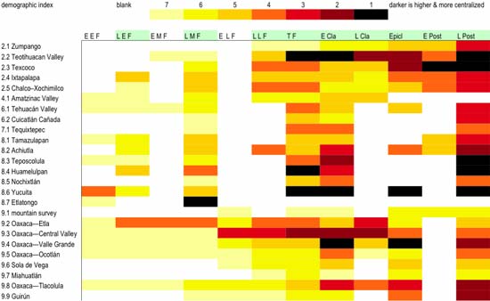
I’m guessing this doesn’t make much sense, but it’s what I’ve been working on for the last few days, and need to tweak a bit more.
The short version is that time goes from left to right (right is most recent), and white means I have no (comparable) data. I’m trying to generate an index of demographic centralization using regional survey data, and this is how far I’ve gotten. The darkest colors had the most centralized populations (more people lived in large communities). Stand by for adjustments.
12 March 2006 at 1:21 pm
kayak woman says:
Is this your first comment?
I was wondering why you were bouncing around between Excel and Filemaker. Now I know. Of course, the whole thing goes straight over my head with a big whooshing noise.
12 March 2006 at 6:27 pm
Sammy says:
Thanks, KW, and it’s almost my first comment. I received my first about an unknown shrub bloom, then a spate about Baton Bob—I now know his name thanks to comments—the guy in pink on the street corner!
13 March 2006 at 6:41 am
kayak woman says:
haha. Obviously I am behind the times. So, that pink guy has a name 🙂