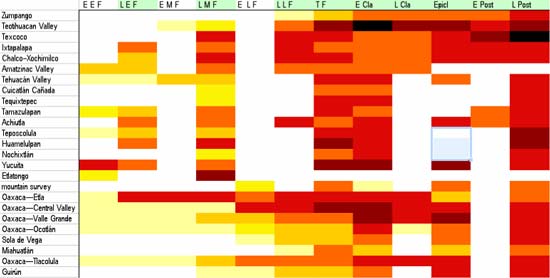
Here’s yesterday’s graphic tweaked, with better logic/data/math behind it; I know it looks like more of the same, but now I feel I can better defend the trends it shows.
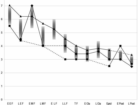
Okay, here’s the freaky thing. The triangles, squares, and diamonds are averages of some of the same data in orange and red and yellow at the top, along with means and standard deviations (the gray graduated bars). Hey, it hurts my head to think about it, so I know your eyeballs are crossed!
Interpretation: the short version is that, over time, the populations of all these places tended to become more centralized (but the variations to this trend are exceedingly interesting and informative); the long version is the book this is destined for!
P.S. Did I mention that I was bouncing between FileMaker and Excel a while back? Now, it’s Canvas, Excel, and Illustrator! Oh, my!