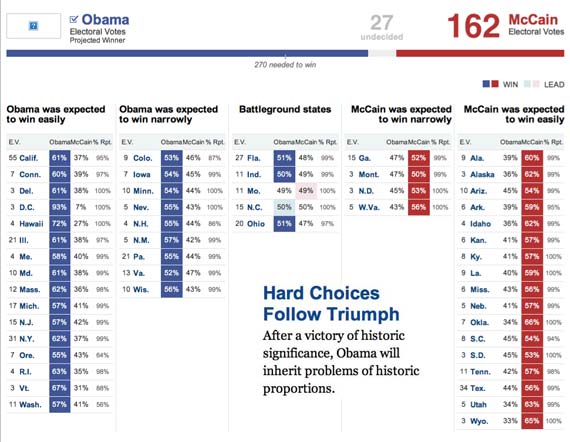
That’s 349 for Obama (the funky question mark)….
Points to the media for impressive graphics showing an impressive win at the top of the ticket, and some close races downticket. The above table is from the New York TImes, and the headline/blurb that I stuck on top of it is from the Washington Post, and was up early this morning. Our country is facing economic nastiness, to say the least. The Pres is our leader, yes, but then there’s Congress. And there’s only so much $$ in the budget (which has also shrunk with the lastest “turmoil”), and it can only go so far.
I couldn’t resist a couple of calculations…. States with 10% difference between the total vote counts for the two candidates controlled 383 electoral votes, meaning most state contests were not that close. They went either for one candidate or the other—STATEwide; locally is another story. Also, the states Obama won had an average of 12.1 electoral votes, while the ones McCain won had an average of only 7.5 votes, and only four of his had 10 or more votes. Note that these states had total-vote differences of less than 5%: Ohio, Florida, Montana, Indiana, North Carolina, and Missouri; they controlled 87 electoral votes.
For more wonderful spatial graphics, visit maps and tables on the webpages of CNN, New York Times, or the Washington Post.
5 November 2008 at 1:09 pm
jcb says:
5 November 2008 at 1:23 pm
Sammy says:
Thanks! (Wonder what the final spread will be….)
8 November 2008 at 7:52 pm
Rana says:
I was quite impressed by the NYT graphics as well. (Though, being in the one county in the whole state of Indiana that was delayed in reporting was a bit embarrasing!)