
Roger Phillips, Figure 8 on Open Rectangle
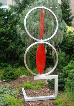
Obviously, this is in the same vein as Split Disk. Same color scheme. Same scale. Same sameness. But different.
Clearly, the mockingbird liked it!
Actually, I liked it less than Phillips’ other piece. I think I found it too symmetrical and too visually predictable.
Maybe, if I’d had a bird’s-eye view, I would have liked it more!
The location worked, and being next to the building gave it an aesthetic validation.
Or something.
There’s no doubt that I’m out of my depth here, even if I stay away from critique and stick to my own personal reaction to this artwork.
I’m sure, in fact, that it’s rather obvious that I’m just trying to pad out the text so the page looks right with this vertical photo (why’d I do that again?).