Decomposing a composition
Friday, 8 May 2026

Still life, composed by nature. Maybe by gravity, and not assisted by a squirrel.
Friday, 8 May 2026
Still life, composed by nature. Maybe by gravity, and not assisted by a squirrel.
Wednesday, 10 September 2025
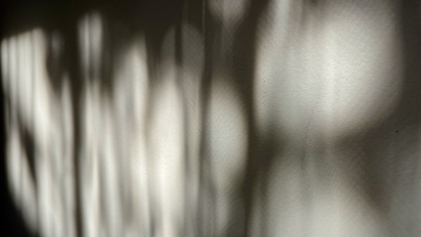
This is from experiments with the photo program.
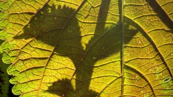
This is a backlit experiment…with the shadow of another sprig.
Friday, 29 August 2025
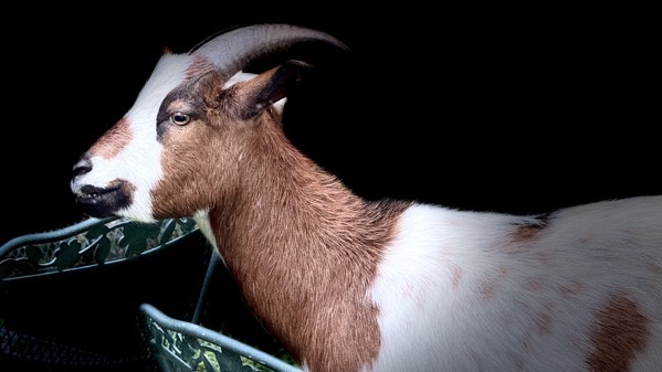
If our temporary pets were any good at climbing trees, these would be leaf-less twig-branches.
Thursday, 21 August 2025
I know you’re supposed to eat more protein as you get older, and I’m surely more elderly, in fact elderly enough to eat more protein. The latest numbers I’ve read are that I should bump it up from my “adult” days on the order of 20% to something like 70 grams or more (probably more). I need to consult nutrition tables to figure out how to do that.
Wednesday, 13 August 2025
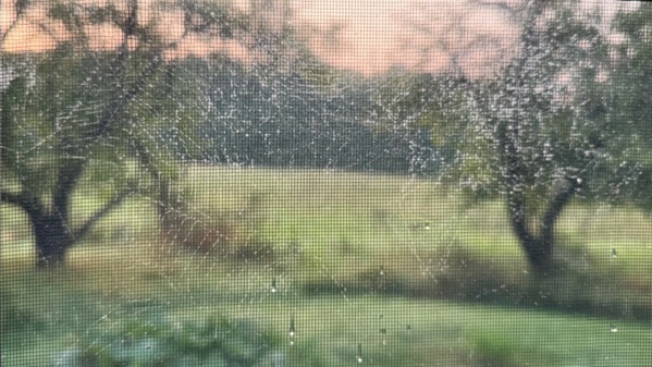
MaNachur rained herself out in the dark hours, so that I found this spider web plastered onto the screen—obvious against the tree-obscured dawn sky…however, I could not get the focus correct. Ahhrrrghhhh.
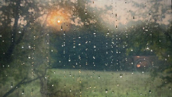
A few moments later, the next screen had no web, but instead gem-streaks—and a first peek of the sun.
Wednesday, 23 July 2025
Often kids accept that the household practices of their home are what happens in the other homes around them. I remember thinking how odd it was that none of the neighbors changed out their living room rugs so that there was a winter one and a summer one. Of course, many of them had wall-to-wall carpeting and that complicated my pattern observation. Turns out, I’ve yet to meet someone who changed out the rugs like my mom insisted we do. Was that a Victorian practice?
Sunday, 27 April 2025

So, I was in a mood, and the tomato seemed to need a moment in center stage.
Tuesday, 25 February 2025
Unwatered fountains look like something’s missing (duh fits, but it’s more than duh). We’re on the edge of the first raft of spring pollen, so I suspect fountains will flow soon.
This somewhat pineapple-y fountain is in Greenville EssCee, and no, it doesn’t turn.
Sunday, 16 February 2025
A line of storms came through about 4:45am…very hard rain and wind. When daylight came, we saw two big trees down in our back yard, but not on or (I think) threatening a structure. Noontime, we had a tree guy out assessing the situation. We’re on track for tree “extraction” beginning tomorrow morning.
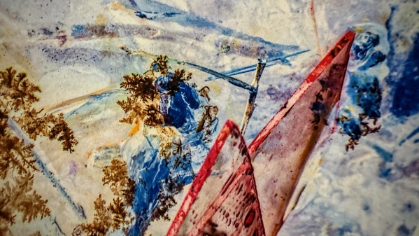
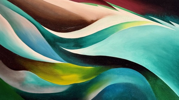
Image: another close-up from Georgia O’Keeffe show we saw yesterday at the High.
Saturday, 15 February 2025

Flower center.

Georgia O’Keeffe: White Flower, 1929.

White Flower, super contrasty, altered. The “grooves” that section the petals are interesting; I didn’t notice them standing in front of the painting, although they are plain as day. Instead, I noticed the subtle shading of the colors…yellows, blues, blue-greens…and the background in the upper corners.
Thanks, MSM, for suggesting this High adventure.