Brasstown browse
Saturday, 21 April 2007

From atop Brasstown Bald, we descended the old road, now known as Wagon Train Trail, enjoying unwinding vistas, and watched over by the Brasstown tower.
Saturday, 21 April 2007
From atop Brasstown Bald, we descended the old road, now known as Wagon Train Trail, enjoying unwinding vistas, and watched over by the Brasstown tower.
Tuesday, 27 February 2007
The way cool thing about anthropological archaeology is that anything interesting can be considered within the field. Poetry? Yup. History? Yup. Climate change. Yup. Keeps me coming back!
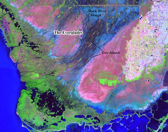
This colorful image is from a report by Margo Schwadron, on the web from the venerable journal Antiquity, examining prehistoric settlement of the south Florida Everglades. Given the effects of small fluctuations in sea levels on this terrain, where people lived should directly reflect when that spot of ground was a) above water, and b) accessible.
Love those smeary-appearing “tree islands”. Just imagine how many bugs would attack you if you visited them.
Tuesday, 20 February 2007
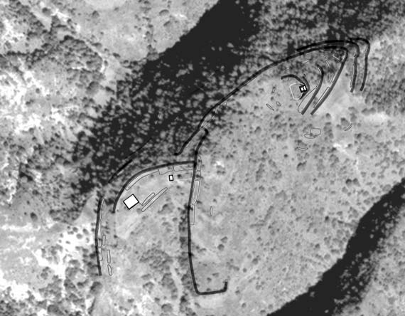
What you’re looking at here is a moderately high-resolution aerial photo (more or less) of an eroded hill-peak down in the Mixteca Alta (see this page), with some shapes drawn on it (thank you Illustrator). The shapes variously represent temple-mounds (the white squares), residential terraces (those long shapes rather like bacilli), and retaining walls (the long grey wide lines).
The whole mess is a map of a residential and civic-ceremonial architectural cluster slopped across a ridge, part of a now-abandoned community that extended across a spider-shaped set of ridge tops beyond the portion shown here, and had several thousand residents in its heyday. Occupation spanned the Classic and Postclassic (roughly), but now the hilltop is pretty eroded making discerning the architecture not only difficult while standing there, but hair-pullingly difficult if you’re trying to make this map—my task for today!
Thursday, 14 December 2006
Today we transitioned from the Midwest home! Miles and miles of I-75 and I spotted this sign, long enough before dusk to know we’d get home before dark, and could breathe a huge sigh of relief.
Friday, 29 September 2006

Remember those not-so-cute ducks from last spring? (This one’s for you, rmj.)
Several webbie pages of interest: jcb sent me a link to this page, on information aesthetics. Really. Information display to the max. And on that page, I found a link to this page, which has a nifty changing map of nations, states, and empires across the Middle East over the last 3K years. Makes me think my black-and-white Word tables are—well ,I admit it, I knew it already—borrrrrrrr-ing.
Tuesday, 5 September 2006
Maps fascinate me. After all, they take a planetary sphere and reduce (usually a piece of) it to a flat version that is instructive and compelling (at least the good ones do). Essentially, a map is a kind of propaganda, the product of a suite of choices that prioritize certain things and disguise or eliminate others.
Cartographers control multiple mapping elements, especially projection, orientation, scale, and symbols. Scale, orientation, and symbols are straightforward concepts. Scale is the simplest—a map may have a single scale, or the scale may vary in certain directions; the accuracy of that scale is also variable. We often think of orientation as “which way is up?�?, but myriad choices may be made; AAA strip maps would prioritize the route in the layout. Symbols allow distilling of complex ideas and information constituting the pictorial language of the map.
Projections are trickier. Here’s the fifty-cent definition of cartographic projection: the representation, on the plane, of all or part of the terrestrial ellipsoid. Projections are grid systems (where’s the datum?) that in effect generate geographic addresses, and introduce systematic distortions. Map projections affect area, shape, direction, distance, and scale, such that not all can be accurate simultaneously.
When building, drawing, or constructing a map, you have to first select your projection—in effect, you first choose what to prioritize, then orientation and scale.
Of course, with new programs like Google Earth (with interactive projections), hand-held GPSs for the masses, and even augmented reality, cartography and projections are increasingly complex and in flux.
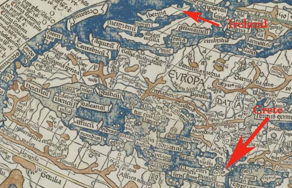
All of this is by way of the fact that I came across this Boston Public Library interface that lets you look close-up at a 2nd century map by Ptolemy, published in 1482, and other maps. Click on “Open in Map Viewer�? for the closeup and then zoom in!
Thursday, 24 August 2006
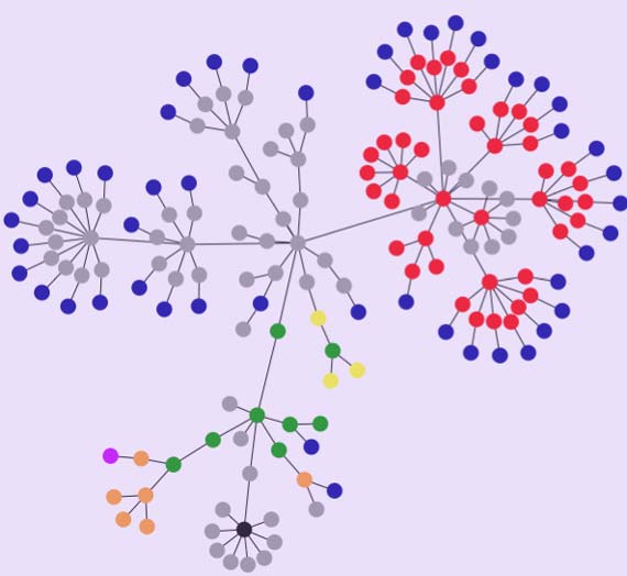
Today it is the rage to use this to make a graphic version of the links on your web page. Mine’s above and here’s ababsurdo’s.
I wonder if the recipes are the little grey bunch at the bottom…?
And don’t ask me what tag clouds are….
Tuesday, 22 August 2006
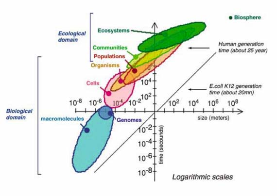
One thing I’m grappling with these days is how to graphically portray scale and time. It’s a gnarly problem. Here, Alain Pavé shows overlapping scales of interactions for entities ranging from teeny things smaller than genomes to ecosystems and biospheres, all wrapped up in a single package, that at least on first blush, looks accurate. (Just how small are the smallest organisms anyway?)
Obviously, using two axes is an obvious solution (time on y and scale on x). I’m pondering adding a z axis, with a third variable (e.g., another kind of scale, for example size in extent—hectares—vs population). Hurts my head to try and actually generate that figure, however.
Fortunately, my bright, wise hubby, the Genius Wizard, has just purchased the latest Edward Tufte, so a guide is at hand….
* Pavé, Alain. 2006. “Biological and Ecological Systems Hierarchical Organization,” in Hierarchy in Natural and Social Sciences. Edited by Denise Pumain, pp. 39–70. Dordrecht: Springer. Figure 2, page 48.
Tuesday, 8 August 2006
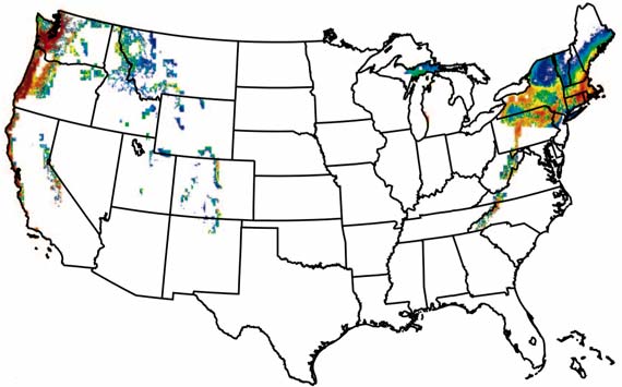
Some climatology types have examined the effect on agriculture in the US—specifically premium wine grape areas—by a continued trajectory of increasing temperatures over the next century. The figure they used is 2–6°C. This is Figure 2-f, showing where the prime areas will shift to—that is, those areas lacking extremes of heat and cold. They make the point that wine is economically significant with 3.5 million tons of winegrapes out of approximately 6 million tons of grapes harvested each year. By converting them into wine, their value increases greatly, with concomitant deleterious effects if their production drops this much.
This is your world, and the projection is not pretty. Note how few premium grapes will come from California. In short:
… areas marginally suitable for winegrape production in the current climate were nearly eliminated and the area capable of consistently producing grapes required for the highest-quality and highest-priced wines declined by >50%.
Don’t trust my word; download the original here.
And, no, I haven’t seen Al Gore’s movie yet. Have you? What’d you think?
Tuesday, 20 June 2006

Here’s a map of distribution of fluted points (loosely “arrowheads,�? but they were really spear points or knives) by county across the US (mostly), current as of 1998, with the density reflected in the darkness of the blobs. The fluted points were made by the peoples who successfully colonized the New World, although there may have been earlier arrivals who did not leave genetic or linguistic evidence of their presence. These data suggest the fluted-point people did not arrive along an ice-free corridor through the Rockies, but instead worked their way considerably southward along the Pacific coast, then crossed eastward from what’s now southern California. Although there’s discussion of earlier and later arrivals from Europe/Greenland, this bunch came from Asia. These fluted points date to the 1500 years prior to 11,200 years ago.
John and I heard the latest on this from Dave Anderson, at a lecture at Fernbank (site loads slowly) recently.
Map from: Anderson, David G., and Michael K. Faught. 1998. The Distribution of Fluted Paleoindian Projectile Points: Update 1998. Archaeology of Eastern North America 26:163–87.